The Mechanical Room: Designing Digital Scarcity
How a custom, dark-mode membership ecosystem translated an exclusive, hidden-basement speakeasy into a high-utility digital experience.

Project overview
Role: Lead UI/UX & Brand Designer
Core Focus: Brand Identity Design, Dark UI Architecture, Gated Membership Systems, Responsive Web Design
The Goal: Replicate the physical speakeasy’s exclusive, hidden atmosphere digitally, while creating a seamless platform to drive paid "club" memberships.
Translating Atmosphere to Interface
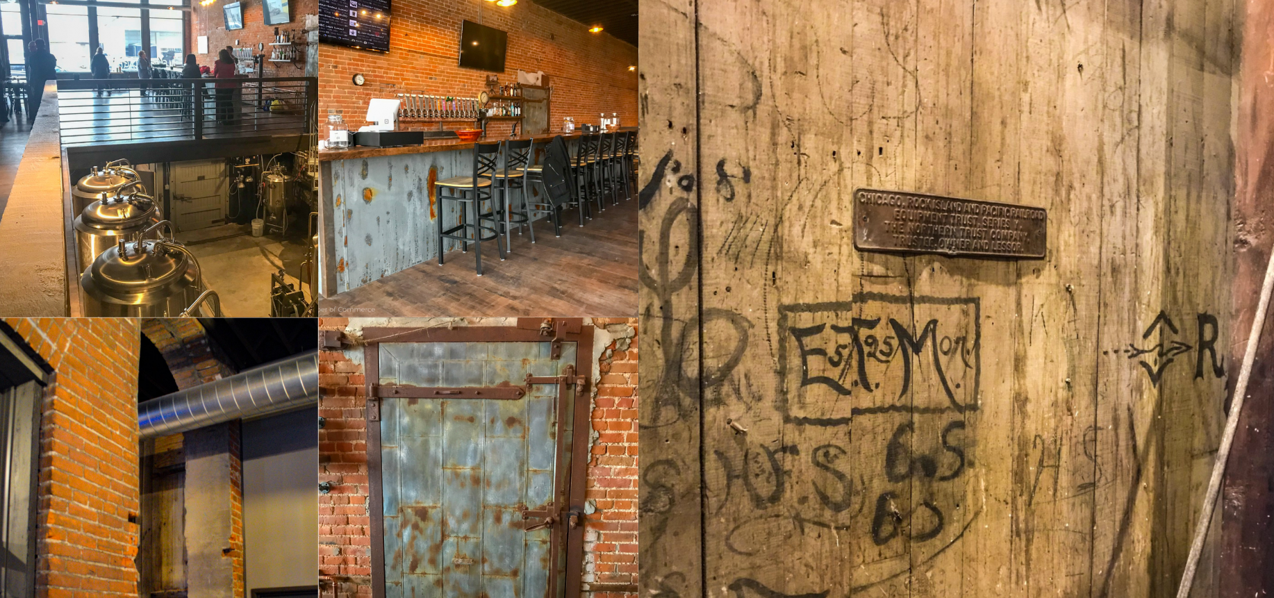
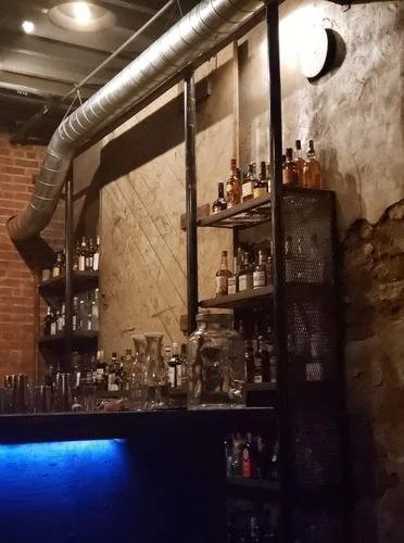
Web design is typically built around maximum visibility and searchability. But how do you design a website for a speakeasy located in a historic basement with no public address, highly limited occupancy, and an intentionally hidden entrance?
The client needed a digital extension of this mystery. The site had to feel like a "secret handshake"—dark, gritty, and industrial—while serving a critical business model: a premium membership system offering exclusive perks, member-only pricing, and event access.
The design challenge was twofold:
Atmospheric Fidelity: Capture the "steampunk, old-school, and mechanical" aesthetic without compromising digital accessibility or readability.
Frictionless Exclusivity: Design a gated membership onboarding flow that feels exclusive and high-end, rather than tedious.
The Brand Identity: Industrial Steampunk
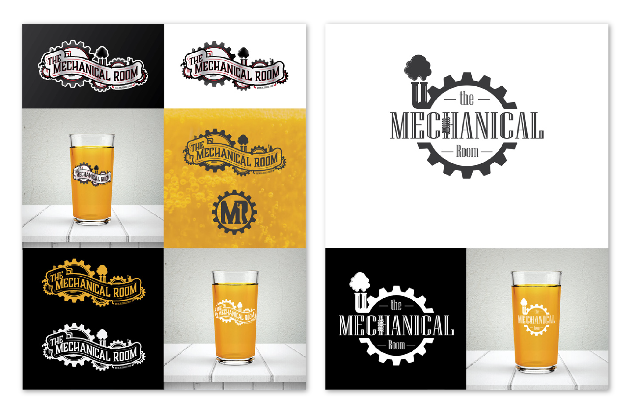
Before building the website, the brand needed a visual anchor. The client requested a logo that felt mechanical, historic, and grounded.
I explored two design directions: a highly intricate, complex engine-like mark, and a distilled, cleaner mechanical seal. The client selected the cleaner logo option, which provided the perfect balance of old-world industrialism and modern digital scalability.
We established a design language utilizing:
A Metallic Palette: Deep, rusted irons, charcoal grays, and warm, brassy gold accents.
Tactile Textures: Subtle grunge overlays and industrial textures that mimic raw iron and concrete.
Classic Typography: Serif headlines that nod to the historic Mercantile Building, paired with clean, highly readable sans-serif body text.
Gated Membership UX
The heart of the business model is the "Club" membership. To make joining feel like getting a physical brass key to a private room, I designed a streamlined, high-contrast membership portal.
Instead of standard, sterile forms, the registration and account portal utilizes vintage ticket-style design elements and clear, high-contrast layouts. This ensures users can easily view their member-only pricing and unlock exclusive perks, reinforcing the premium value of their subscription.
Dark UI & Modern Accessibility
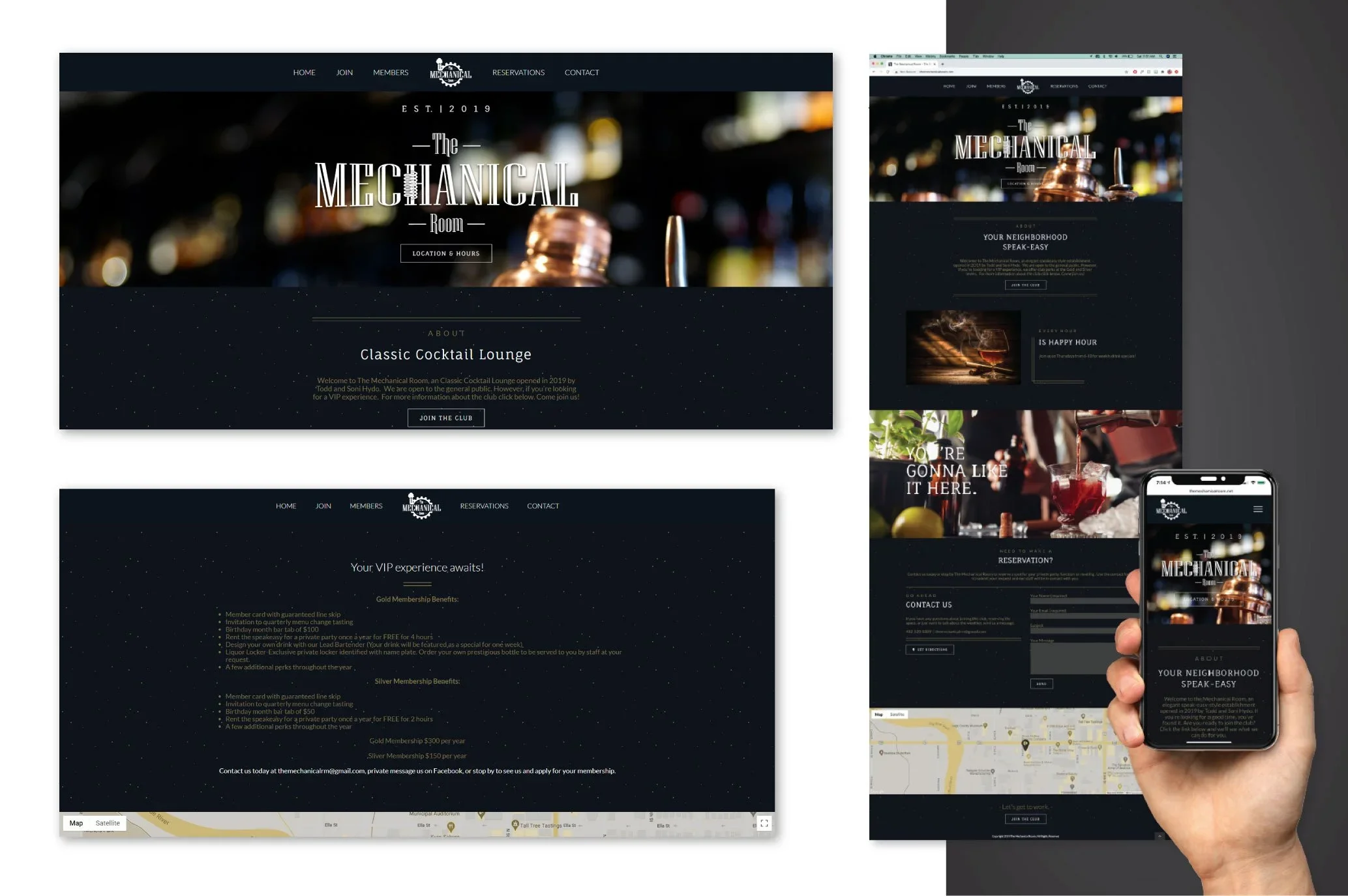
Designing highly stylized, dark grunge interfaces is notoriously difficult because of accessibility. High-vibe dark designs often fail contrast requirements, making text unreadable for users.
To solve this, I carefully balanced the low-light aesthetic with WCAG-compliant readability rules:
Visual Hierarchy: Using high-contrast brass and gold accents exclusively for action items, call-to-actions (CTAs), and navigation highlights.
Text contrast: Opting for soft, off-white typography over deep charcoal backgrounds, preventing eye strain while keeping the dark, smoky speakeasy vibe intact.
The Impact
By treating the digital platform as a continuation of the physical experience, the website successfully bridges the gap between digital utility and speakeasy mystery:
Atmospheric Alignment: The digital touchpoint perfectly mirrors the moody, historic vibe of the physical venue, building immense anticipation before a guest even steps through the door.
Infrastructure for Growth: The membership system provides a solid, secure platform for the venue to scale recurring revenue, easily managing member database details and perk redemption.
High-End Mobile Utility: Because most users access the site on their phones while searching for the bar downtown, the mobile experience is highly optimized, ensuring the menu, membership portal, and booking tools load instantly in low-light environments.
-
![]()
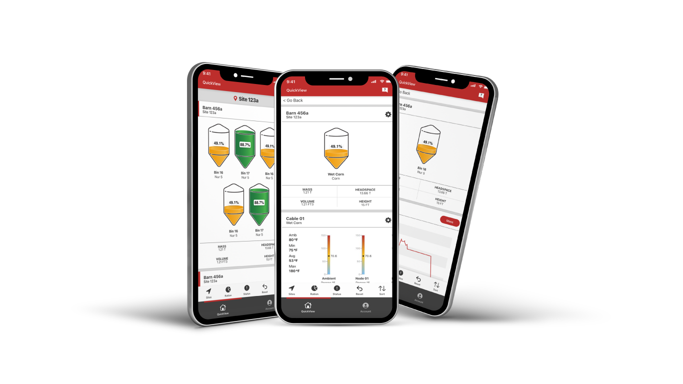
BinCloud
An inventory-monitoring design system that simplifies complex industrial sensor data into high-utility, customizable dashboards.
-
![]()
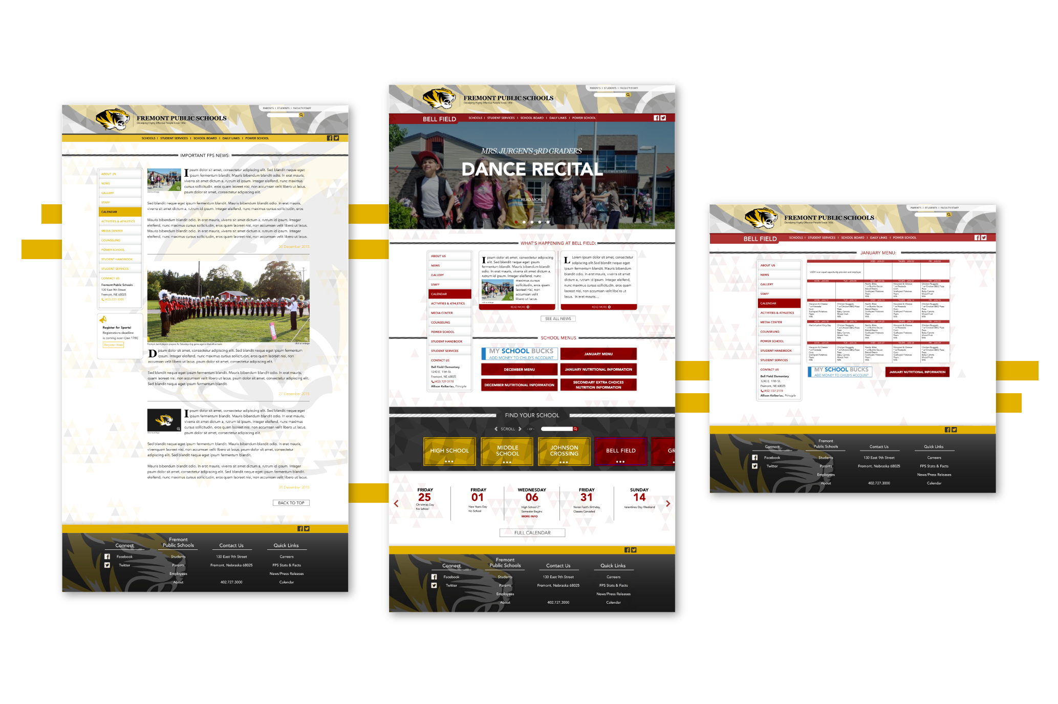
Fremont Public Schools
A modular, multi-school web ecosystem that unifies fragmented legacy interfaces into a cohesive, highly accessible platform.
-
![]()
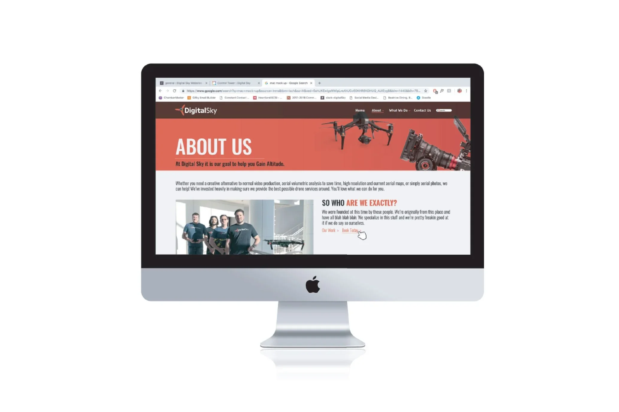
Digital Sky
A high-impact split-screen gateway designed to balance contrasting workflows for creative video and industrial drone services.
-
![]()
The Mechanical Room
An atmospheric, dark-mode digital ecosystem and gated membership portal that translates a physical speakeasy experience online.
-
![Beatrice Mercantile]()
Beatrice Mercantile
A unified, multi-tenant directory that transforms a historic physical building into a cohesive, discoverable digital destination.
-
![]()
Visit McCook
A heritage-driven place-branding system and travel portal designed to celebrate regional identity and drive local tourism.