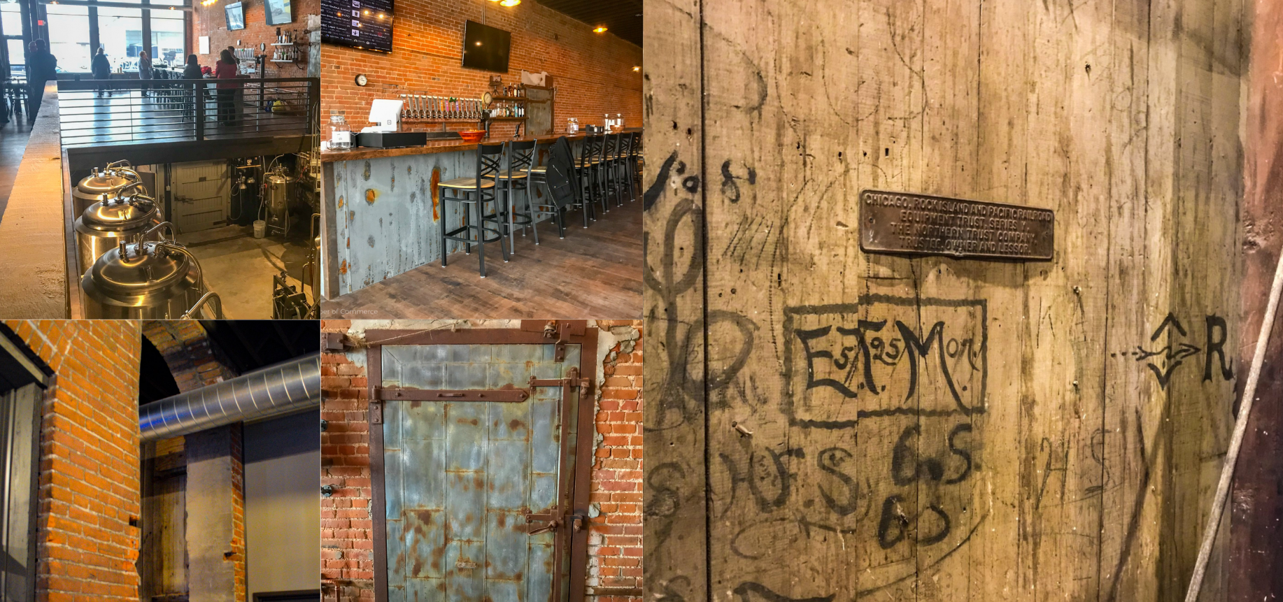
McCook, Nebraska: Branding the Buffalo Commons
How a defiant regional identity and high-utility tourism portal transformed a high-plains community into a proud, scalable digital destination.
Project overview
Role: Graphic & Web Designer
Core Focus: Place Branding & Visual Identity, Information Architecture, Utility UX, Responsive Web Design
The Goal: Overhaul McCook’s digital presence and visual identity to capture the resilient spirit of the high plains, driving regional tourism, event attendance, and local pride.
The "Buffalo Commons" Narrative
In the 1980s, academic researchers proposed that the high plains should be depopulated and returned entirely to the buffalo—calling the concept the "Buffalo Commons."
The people of McCook didn’t just reject this idea; they reclaimed it. They built a fierce regional pride around their perseverance through droughts, booms, and busts. The marketing team at Maly Marketing established a brilliant, defiant brand theme: McCook: The Capital of the Buffalo Commons.
The design challenge was to take this powerful, gritty concept and translate it into a modern digital platform. The site needed to serve as both an atmospheric storytelling vehicle and a frictionless, high-utility tool for weekend travelers, historic tourists, and local event-goers.
Visual Identity: High Plains & Local Heritage
The visual design system honors the natural beauty of Southwest Nebraska and the historical roots of McCook:
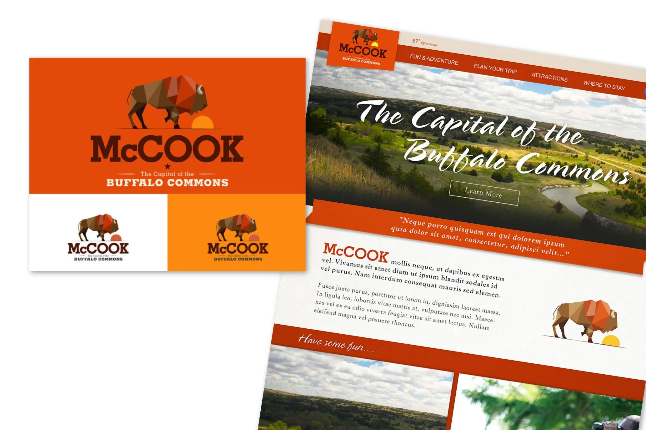
An Earthy, Rustic Palette: Utilizing warm wheat golds, deep sky blues, and rich charcoal grays that reflect the expansive high-plains landscape and classic locomotive heritage.
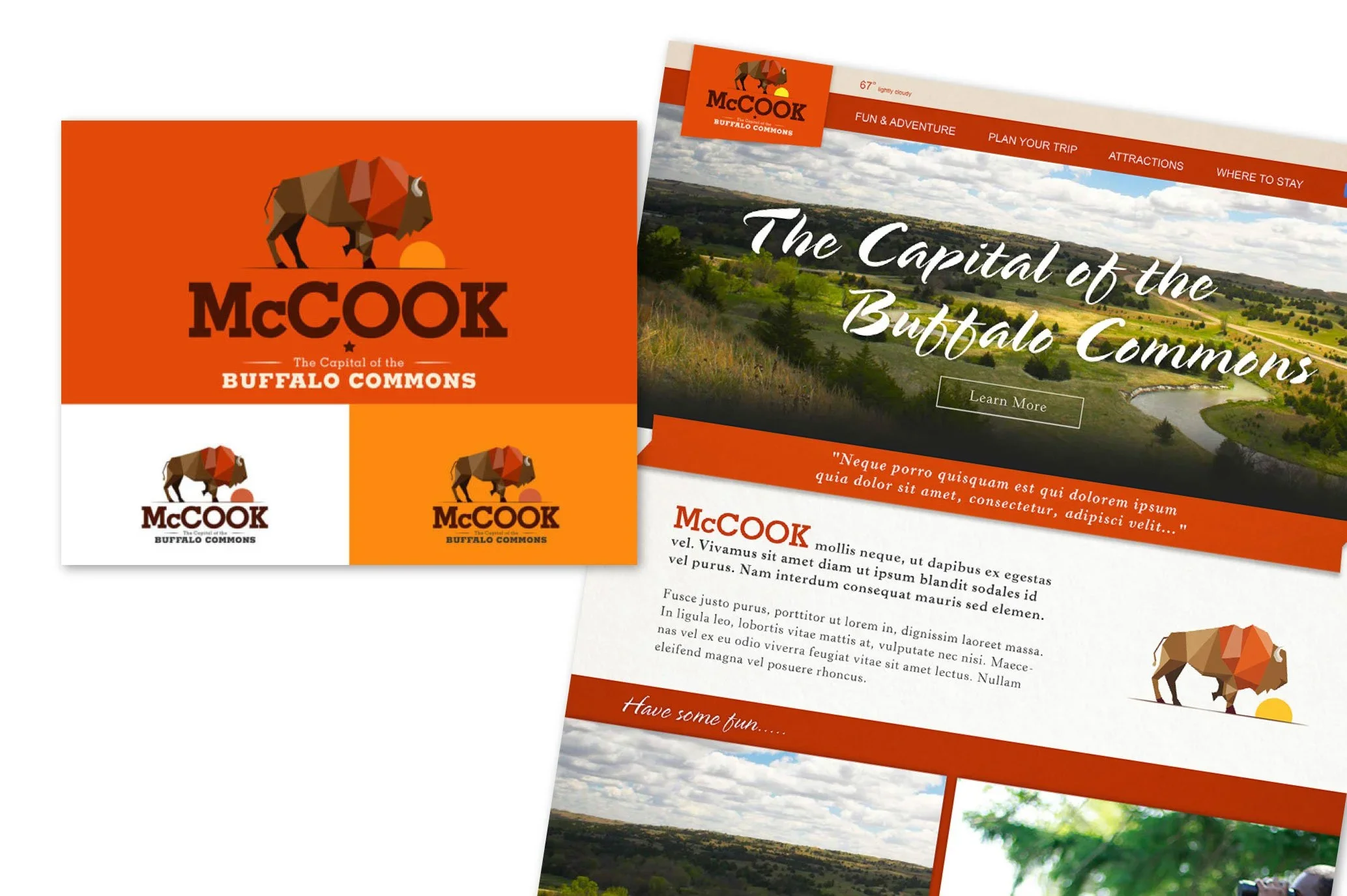
Robust Custom Logo: Designing a proud, weathered brand mark featuring a classic bison profile, instantly anchoring the community as the "Capital of the Buffalo Commons."
Editorial-Meets-Utility Typography: Pairing expressive, heritage-focused headings with clean, highly readable geometric sans-serif body text to ensure modern accessibility.
Designing for Regional Discovery
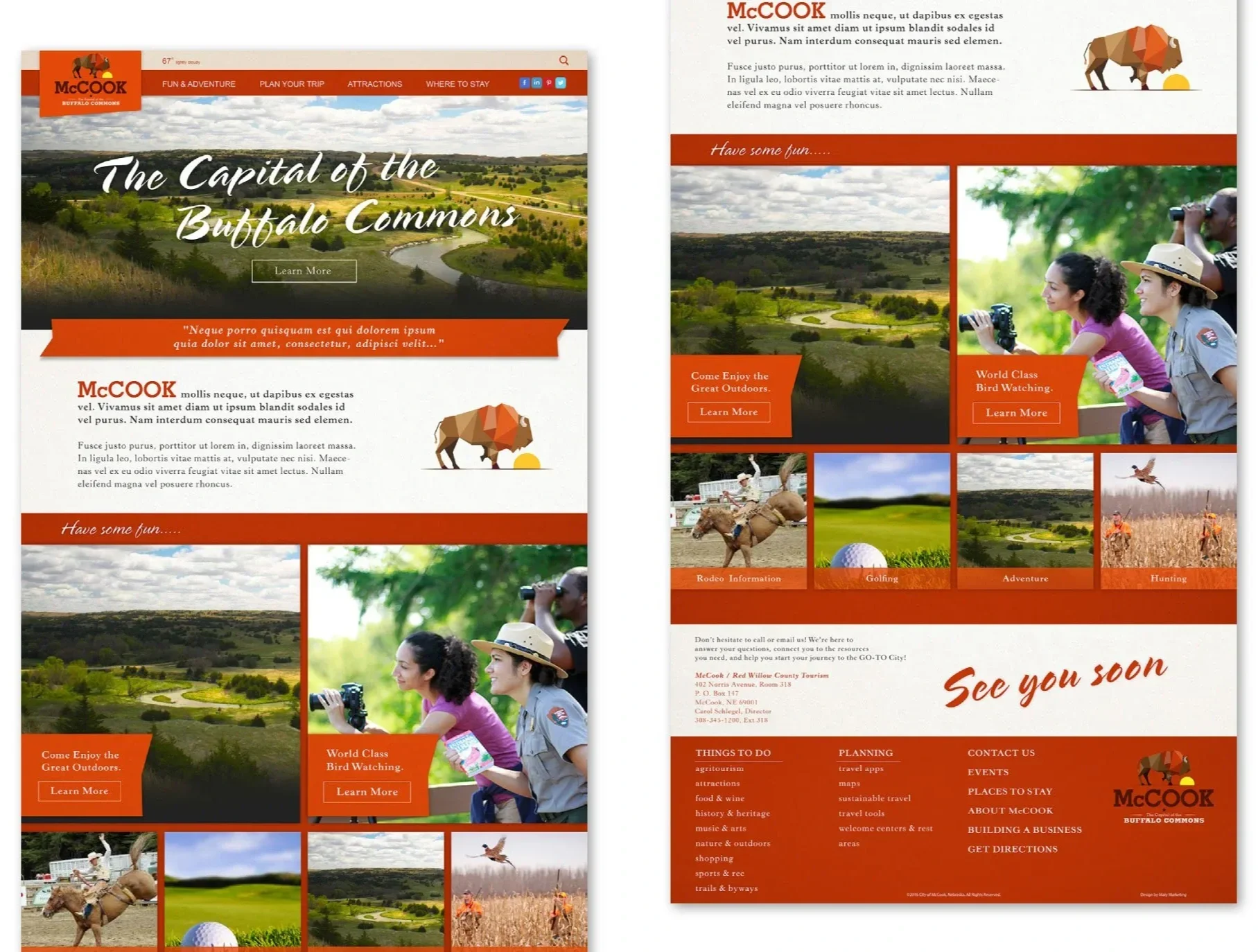
Tourism sites are successful only if they turn digital browsers into physical visitors. I structured the homepage and navigation around high-intent user activities: Things to Do, Events, Dining, and Lodging.
Instead of overwhelming travelers with giant grids of text, I designed clean, visual category cards and intuitive filters. This modular setup allows visitors to easily discover everything from local disc golf courses to historic walking tours.
The Impact
By turning a regional critique on its head and pairing it with clean, utility-focused web design, the new Visit McCook website successfully positioned the community as a major regional landmark:
Elevated Place-Branding: The unified brand identity immediately establishes McCook as a unique, historic destination rather than just a quick highway stop.
Seamless Utility for Visitors: By clustering events, weather, dining, and mapping tools into a single responsive hub, trip planning became an absolute breeze for families and weekend travelers.
Unified Community Voice: The site serves as a powerful regional asset, boosting local pride and highlighting annual traditions like the Heritage Days and the Buffalo Commons Storytelling Festival on a professional digital stage.
-
![]()
BinCloud
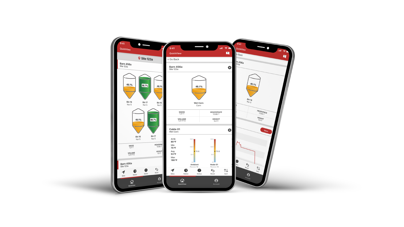
An inventory-monitoring design system that simplifies complex industrial sensor data into high-utility, customizable dashboards.
-
![]()
Fremont Public Schools
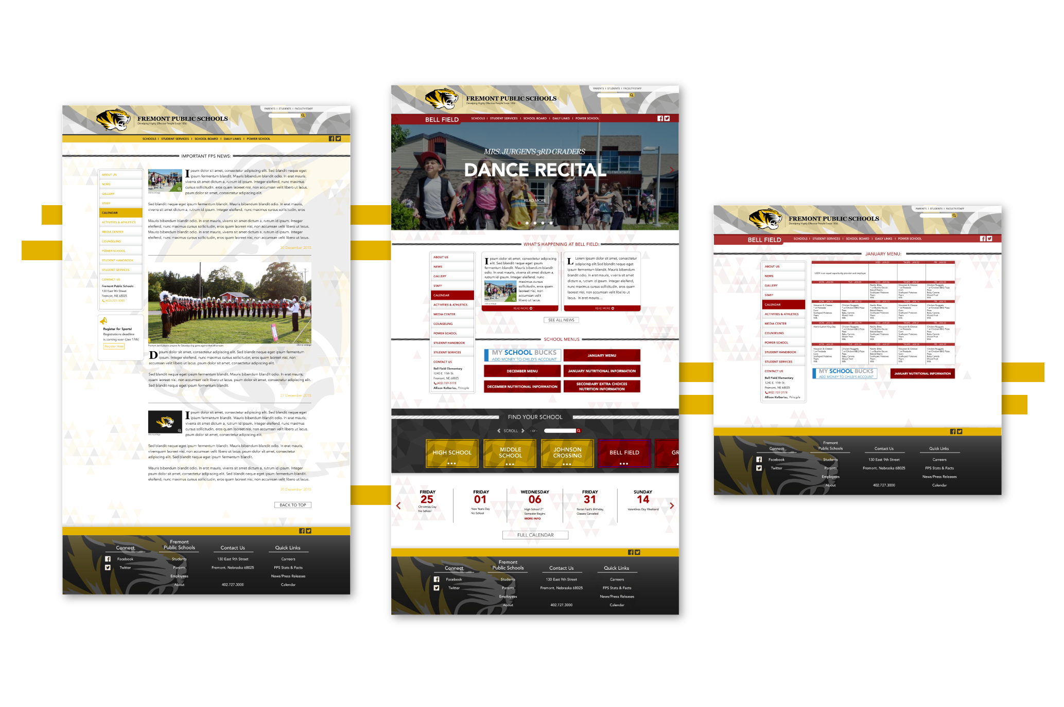
A modular, multi-school web ecosystem that unifies fragmented legacy interfaces into a cohesive, highly accessible platform.
-
![]()
Digital Sky
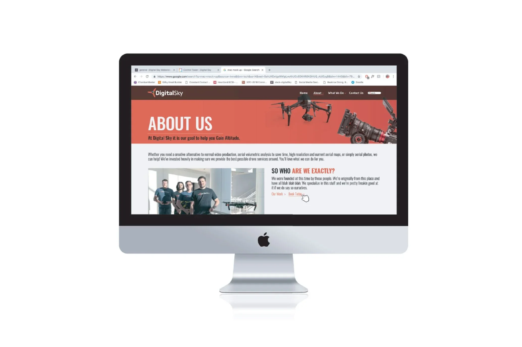
A high-impact split-screen gateway designed to balance contrasting workflows for creative video and industrial drone services.
-
![]()
The Mechanical Room
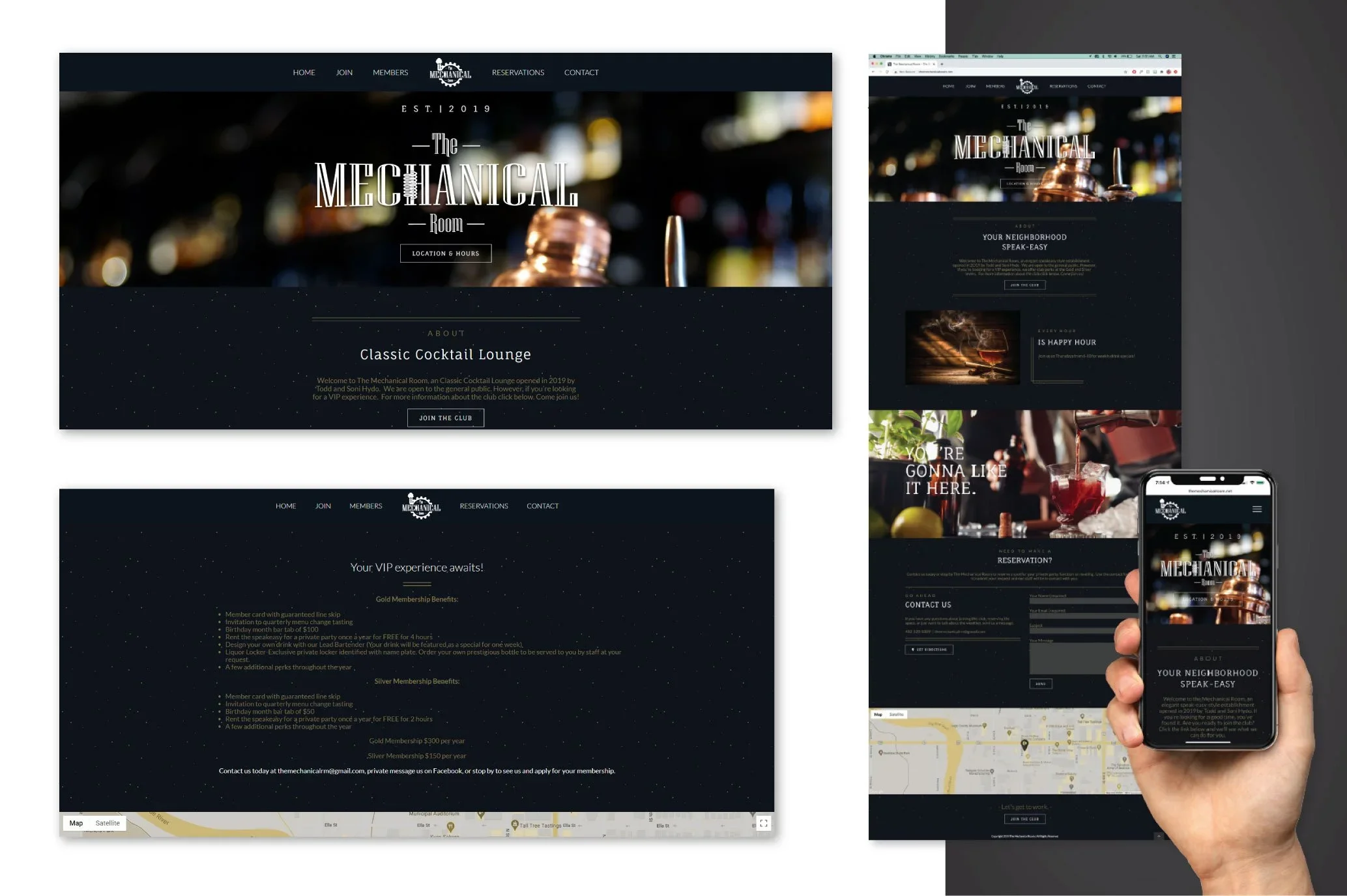
An atmospheric, dark-mode digital ecosystem and gated membership portal that translates a physical speakeasy experience online.
-
![Beatrice Mercantile]()
Beatrice Mercantile
A unified, multi-tenant directory that transforms a historic physical building into a cohesive, discoverable digital destination.
-
![]()
Visit McCook
A heritage-driven place-branding system and travel portal designed to celebrate regional identity and drive local tourism.